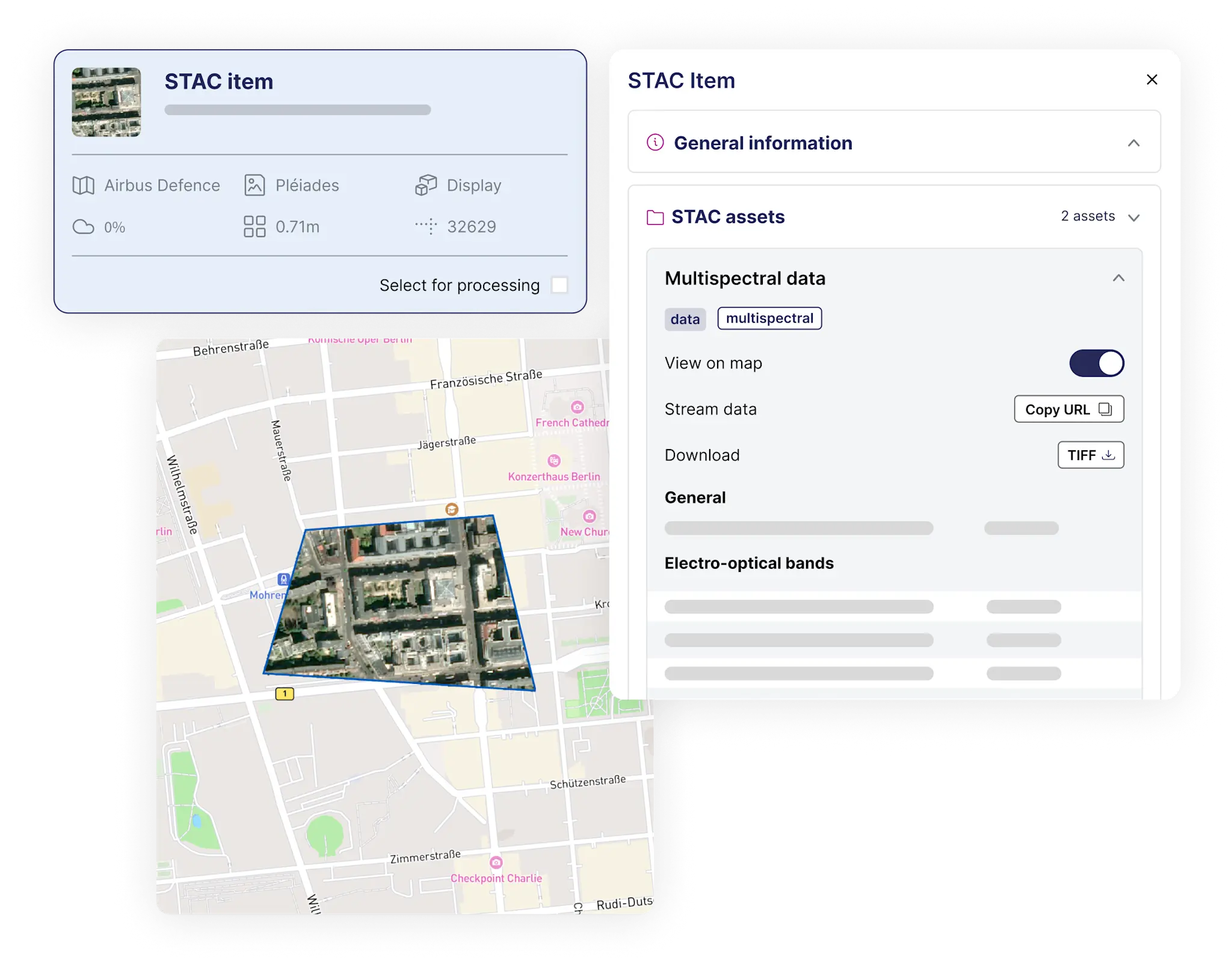
UP42 Storage: Better UI/UX in OneMap
OneMap has been live for around 6 months, and we have learned so much from our customers. It’s time to implement those changes and improve her experience.
The Problem: Squeezed Maps & Clunky Layouts
UP42’s OneMap interface had a critical pain point:
A fixed right-side panel (30% of screen width) forced the map into a narrow, impractical space.
Users struggled to simultaneously view STAC asset data and interact with the map.
Left-side panel components were inconsistent and non-reusable across teams.
Business Impact:
Frustrated users → lower engagement with geospatial tools.
Inefficient workflows → slower decision-making for clients.
The Solution: A Data-Backed Redesign
1. Research: 6 Months of Feedback Synthesis
Sources:
Direct customer complaints (sales/customer success teams).
Informal user interviews (pain points around map visibility).
Analytics on panel collapse/resize behaviors.
Key Insight:
"Users hated the cramped map but needed quick access to metadata."
2. Design Execution
A. Map-Centric Layout
Replaced the right panel with a slide-up bottom panel:
Freed up 80% more map space (now rectangular, not squeezed).
Retained one-click access to STAC metadata.
Dynamic Table Columns:
Let users customize visible fields (e.g., hide "Acquisition Date" if unneeded).
B. Scalable UI Components
Redesigned the left-side panel as a reusable React component (shared across teams).
Consistent card views, spacing, and interactions.
Figma Foundations:
Built with auto-layout, variants, and tokens for cross-team consistency.
Tested on common screen sizes (1280px to 1920px).
3. Validation
User Testing: Confirmed the new layout reduced "pinch-zoom" fatigue.
Dev Handoff: Delivered modular Figma components with usage guidelines.
Impact & Metrics
User Satisfaction:
"Map usability" scores rose 22% post-launch (CSAT surveys).
Efficiency:
Fewer clicks to toggle metadata (slide-up panel vs. fixed layout).
Scalability:
Left-panel component reused in 3 other UP42 tools within 2 months.
