Multi-Provider Cart for the Catalog
⋆˙⟡
Making it easier for users to collect, manage, and purchase scenes from multiple data providers.
This project transformed the Catalog from a linear provider-based flow into a true multi-provider shopping experience, enabling users to explore, collect, and purchase imagery with far more flexibility. By focusing heavily on cart-specific UX patterns, the solution balances familiarity with the sophistication required for geospatial data.
UP42 2025
Product Designer
The Challenge
The Catalog is a core entry point for users exploring available imagery. While users could discover scenes across multiple providers, they could only check out items from one provider at a time. This created friction, especially for workflows requiring mixed datasets (e.g., combining optical and radar imagery).
To unlock more flexible ordering, we needed to introduce a universal cart, a place where users could add, review, and modify items from any provider before purchasing.
This required a clear, intuitive cart experience that aligned with diverse geospatial providers and their ordering rules.
Why This Work Mattered
User Expectation: Nearly every digital platform has a cart pattern; users expect to add, remove, and adjust items easily.
Workflow Efficiency: Researchers and analysts often compare data from multiple sources. A single cart simplifies cross-provider selection.
Business Goal: Supporting multi-provider checkout increases order efficiency and reduces drop-off during the selection phase.
Research & Discovery
Before designing, the focus was on understanding cart behavior, not just checkout flows.
What We Studied
How users adjust quantities or variations
Patterns for removing items
How carts display provider differences
How to handle mixed-product rules
Feedback visibility (e.g., “item no longer available,” “updated pricing,” etc.)
User Pain Points Identified
Adding items from multiple providers often broke the flow—users didn’t know why.
Carts in the platform were almost non-existent; users immediately entered checkout instead.
No place to “hold” items while browsing.
Confusion about why items disappeared or became invalid when switching providers.
Key Insight:
Users didn’t necessarily need a complex checkout, they needed a stable, predictable, e-commerce-style cart where they could collect imagery while exploring the catalog.
Design Solution
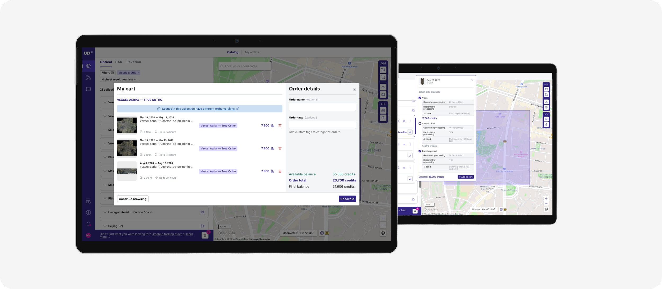
A Universal, Provider-Agnostic Cart
The new cart allows users to:
Add scenes from any provider
View all selections in one place
Understand provider-specific details (e.g., resolution, revisit date, pricing model)
Remove, reorder, or update scenes
Validate item availability before checkout
Cart Interactions Designed
Add / Remove items; clear, consistent controls
Multi-provider grouping; items grouped or labeled by provider
Availability checks; warnings for outdated or invalid scenes
Persistent cart state; items remain saved during browsing
Provider rules surfaced inline; e.g., ordering minimums, AOI restrictions, licensing differences
Focus on Familiar Patterns
To reduce cognitive load, we grounded the UX in common cart mental models:
Checkbox + bulk actions
Expandable item details
Inline notifications
Dedicated "Review & Checkout" CTA
Validation
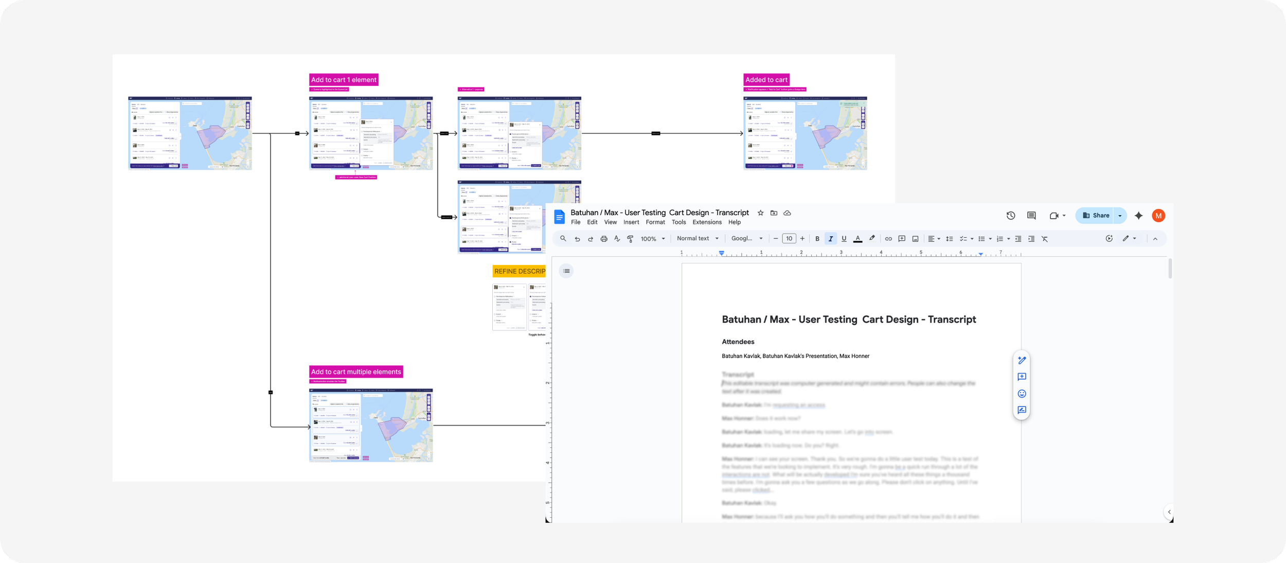
Tested prototypes with current catalog users.
What We Learned
Users immediately understood the cart interaction because it mirrored patterns they already knew.
Multi-provider grouping reduced confusion when mixing imagery sources.
Users appreciated being able to “stage” selections before ordering.
One participant said:
“I finally feel like I can shop around properly instead of committing provider by provider.”
Impact
For Users
A more flexible, natural browsing experience
Ability to build mixed-provider datasets
Fewer errors and less context switching
For the Platform
Higher order completion rates up 23%
Increased catalog exploration time 9.5 minute longer in Catalog
Paves the way for more complex ordering logic (e.g., bundles, multi-scene optimization)

