Map Integration
⋆˙⟡
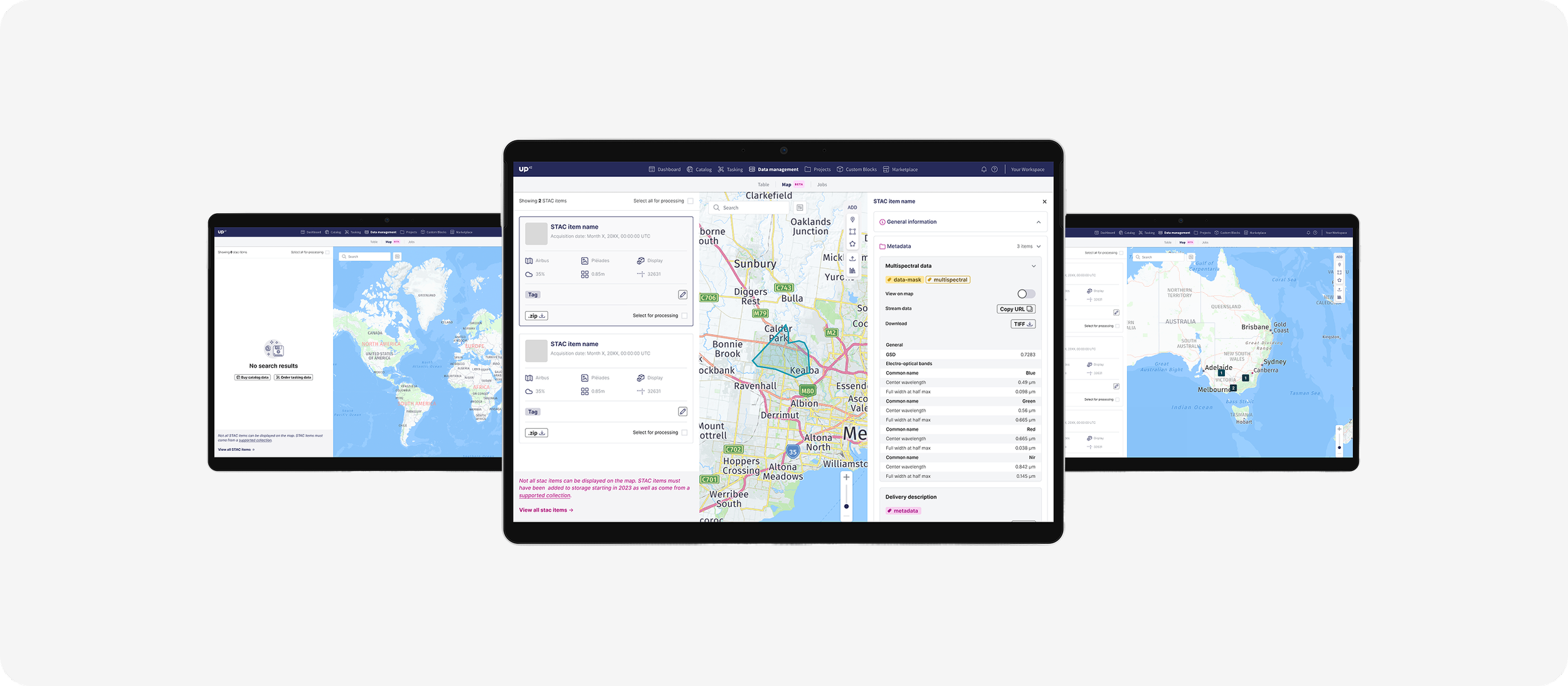
OneMap had been live for around six months when customer feedback revealed recurring frustrations with its layout. The interface forced users into awkward workflows: maps felt cramped, panels were inconsistent, and important metadata was hard to access. To improve usability and engagement, we set out to redesign the experience with a focus on map visibility and scalable UI components.
UP42 2024
Product Designer & Research
TL;DR
We redesigned UP42 OneMap to solve cramped maps and inconsistent layouts. By replacing the fixed right panel with a slide-up bottom panel, users gained map space while keeping fast access to metadata. Reusable components and Figma foundations made the UI scalable across tools. Post-launch, user satisfaction rose, and the new panel system was adopted in three other UP42 products within two months.
Solution
Over several weeks, we synthesized six months of user feedback, ran design iterations in Figma, and validated with end users. The redesign centered on freeing up map space, improving metadata access, and building consistent, reusable components for cross-team use.
Research plan
Gathered feedback from sales and customer success teams.
Conducted informal user interviews around map visibility.
Analyzed analytics data on panel collapse/resize behaviors.
Core insight: users needed more map space but still required quick, easy access to metadata.
Research & Synthesis
Users consistently reported frustration with the fixed right-side panel taking up ~30% of the screen.
Feedback highlighted a lack of consistency in left-side panel components, slowing workflows across teams.
Synthesis pointed toward a map-first redesign, backed by flexible UI elements.
Design & Validation
Map-Centric Layout: replaced the fixed right panel with a slide-up bottom panel, unlocking ~80% more map space while retaining one-click access to STAC metadata.
Dynamic Table Columns: gave users control over visible fields for a more efficient workflow.
Reusable Components: rebuilt the left panel as a React-based, scalable design system element.
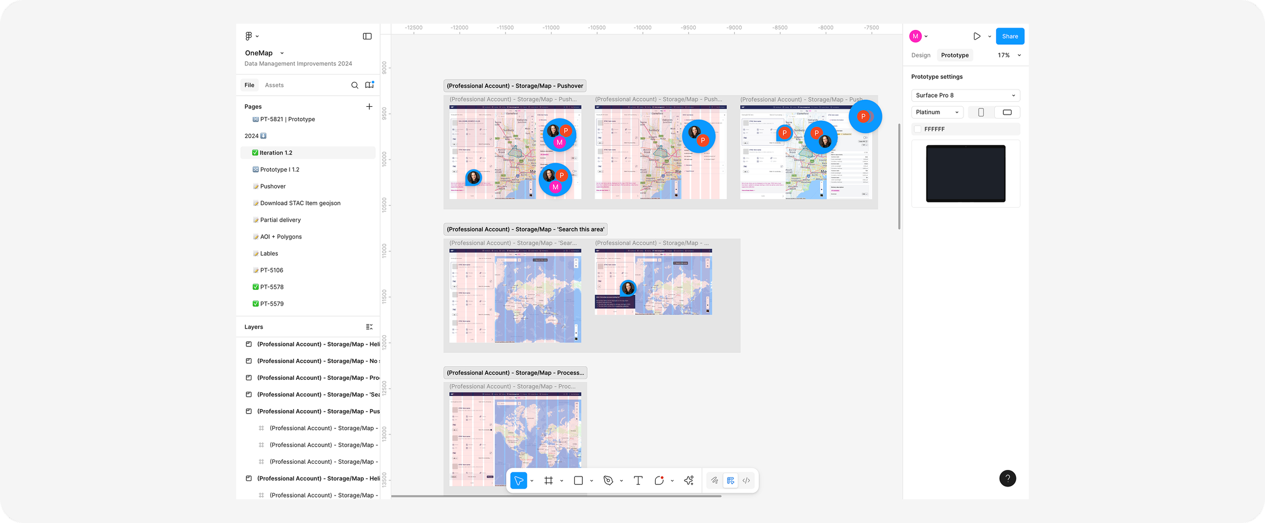
Figma Execution: applied auto-layout, variants, tokens, and responsive testing across screen sizes.
Validated with user testing, which showed reduced “pinch-zoom fatigue” and smoother workflows.
Handover & Vision
Delivered developer-ready Figma assets, complete with annotations, to support implementation.
Positioned this Console enhancement as a foundational step: not just fixes for today, but a platform for more API-driven features in future releases.
Impact
Higher Satisfaction: “Storage usability” satisfaction increased in CSAT surveys post-launch.
Efficiency Gains: fewer clicks needed to toggle metadata, saving time in asset exploration.
Scalability: redesigned left panel was reused in three other UP42 tools within two months.

